A multi-phase rebrand across restaurant, market, takeaway and home dining. What began as a practical response to COVID grew into a wider identity system for a restaurant learning to exist in several forms at once.
The work began during COVID, when l’Gueuleton needed to move beyond the dining room and create new ways for customers to experience the restaurant from home.
What started as branding for takeaway and cook-at-home services developed into a wider identity system across the restaurant, market, packaging, menus, window decals and photography.
The challenge was to make the new services feel practical and immediate — without losing the warmth, wit and recognisable character of the restaurant — and to do this in a way that could scale into a permanent identity once the dining room reopened.
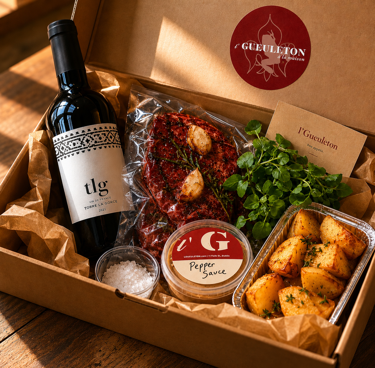
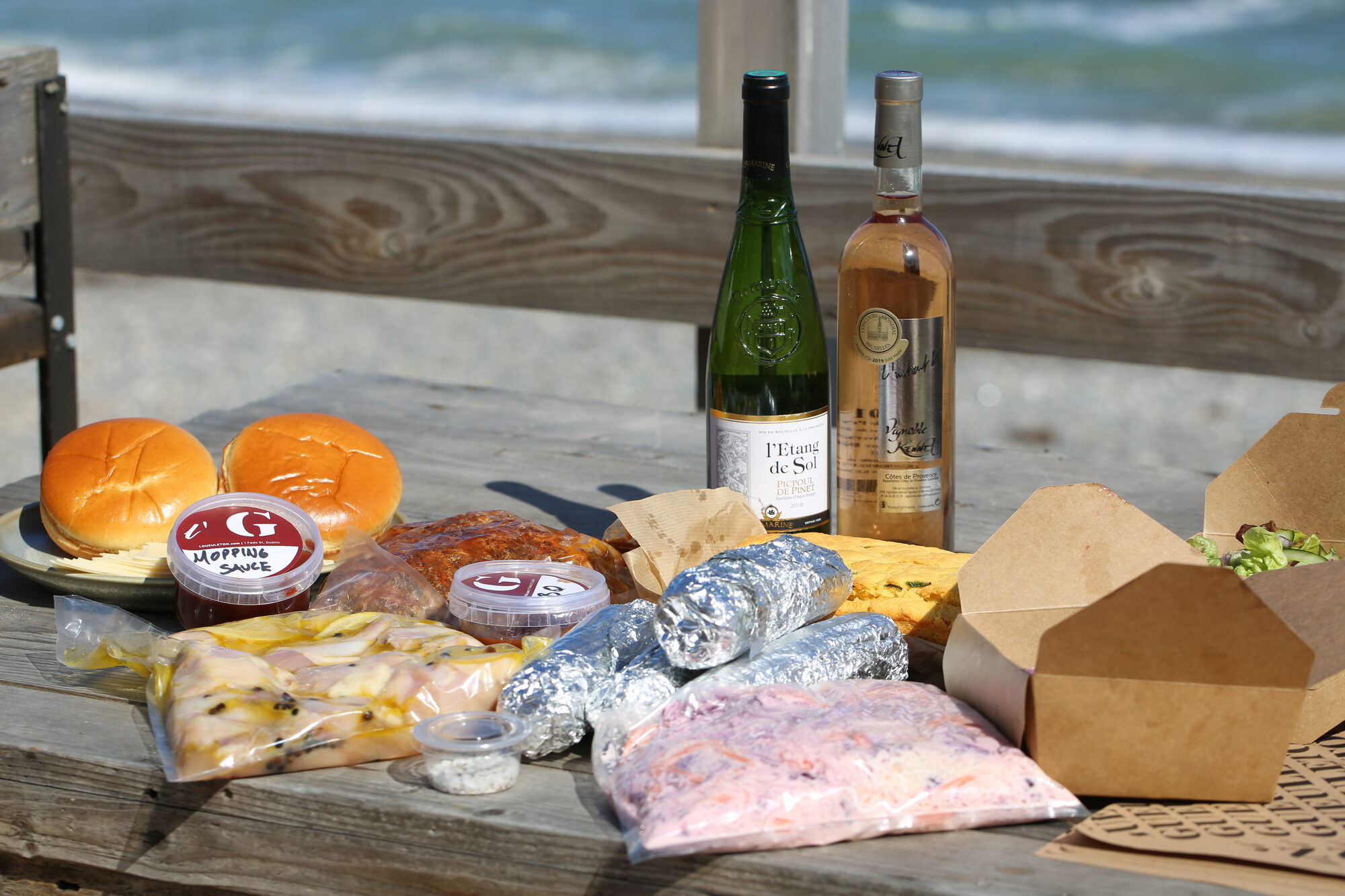
Two sub-brands carried the restaurant out of the dining room — Petit l’Gueuleton for grab-and-go, and l’Gueuleton à la Maison for cook-at-home.
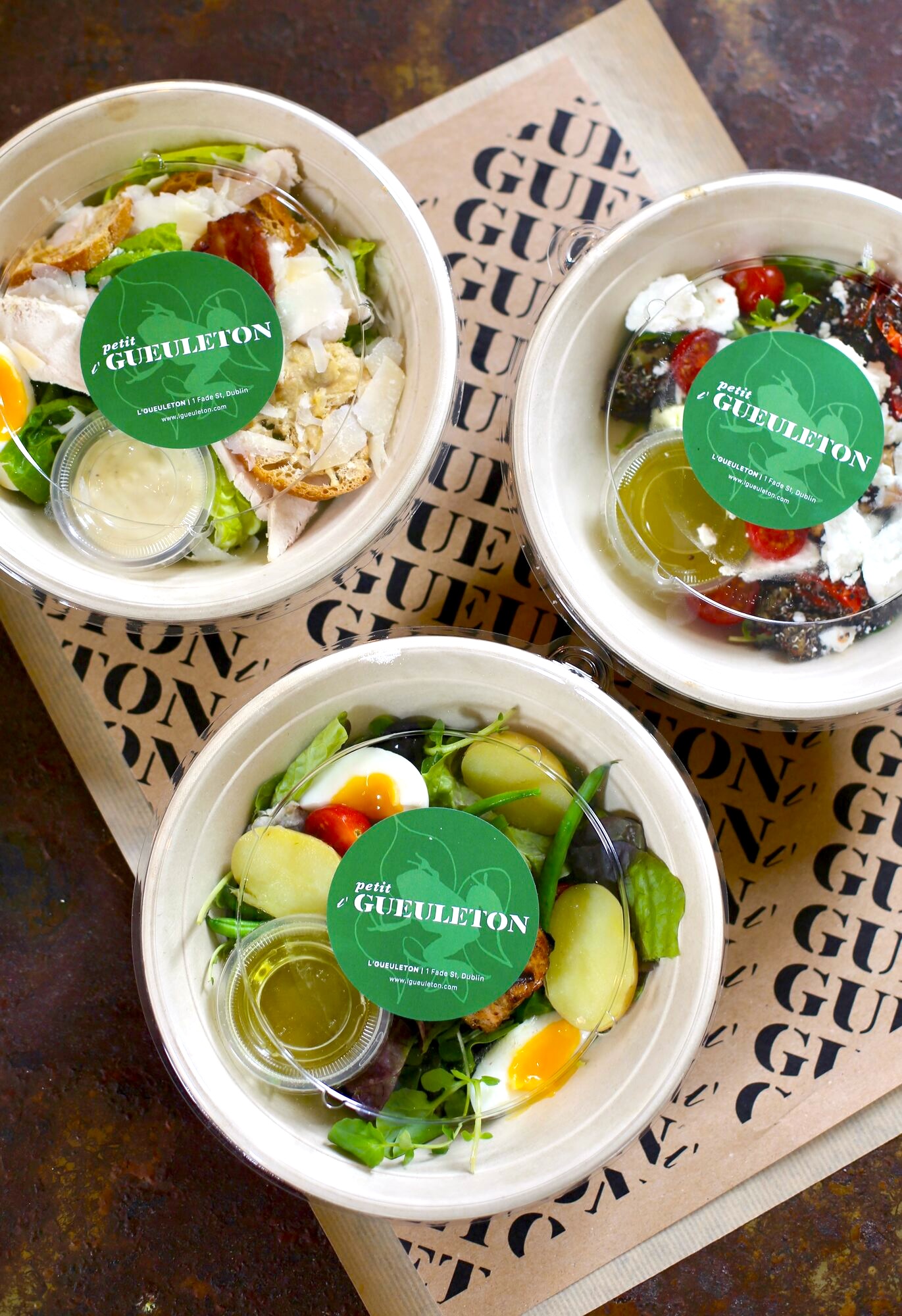
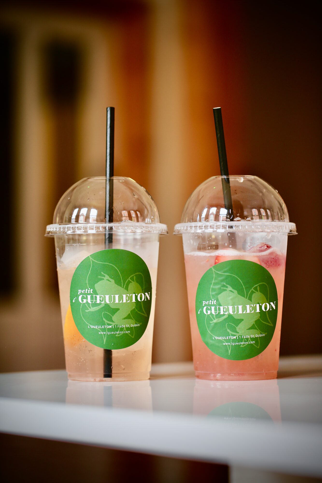
Petit l’Gueuleton was the casual takeaway offer — salads, sandwiches, drinks and grab-and-go items served from the shopfront. The identity used circular stickers, bold type, illustrated details and repeat-pattern paper to create a flexible system across simple packaging.
À la Maison leaned into a richer, more romantic tone: oxblood red, cream, soft botanical illustration and bold bistro-style type. The home-dining system needed to feel more generous than takeaway — less disposable, more like a restaurant experience carried into the house.
One restaurant, learning to exist in several forms at once — bistro, market, takeaway, home box, coffee counter.
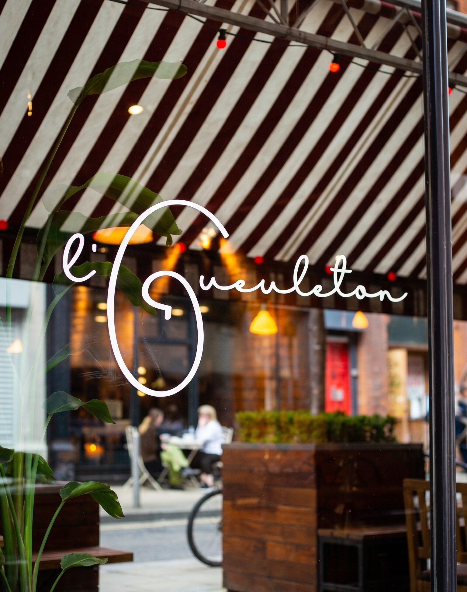
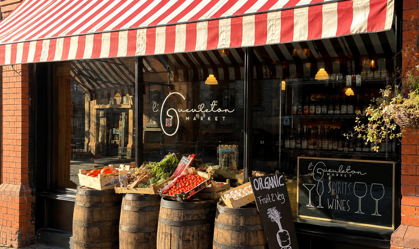
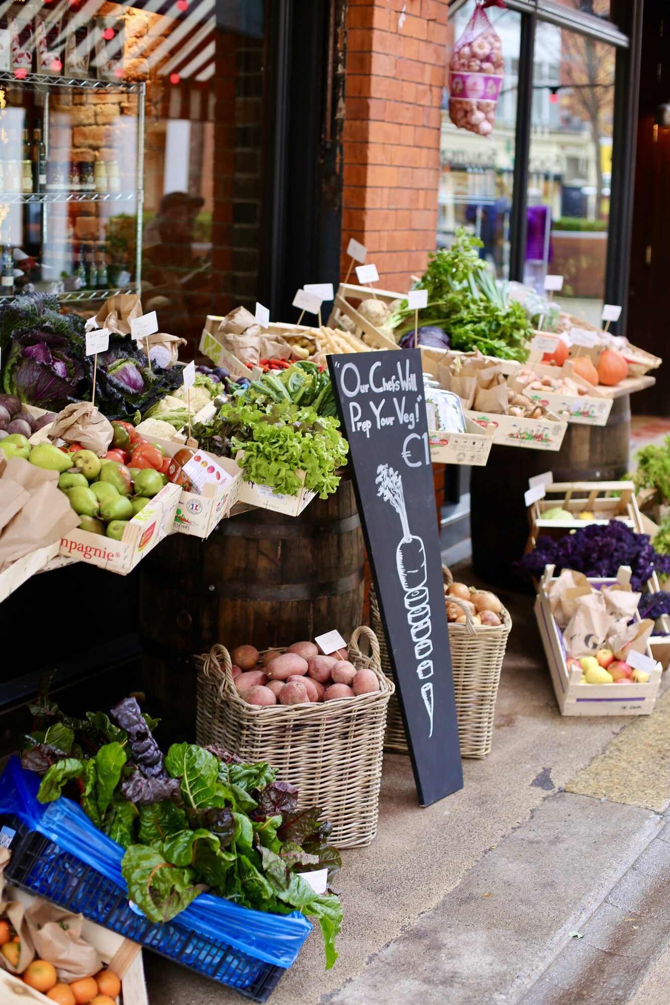
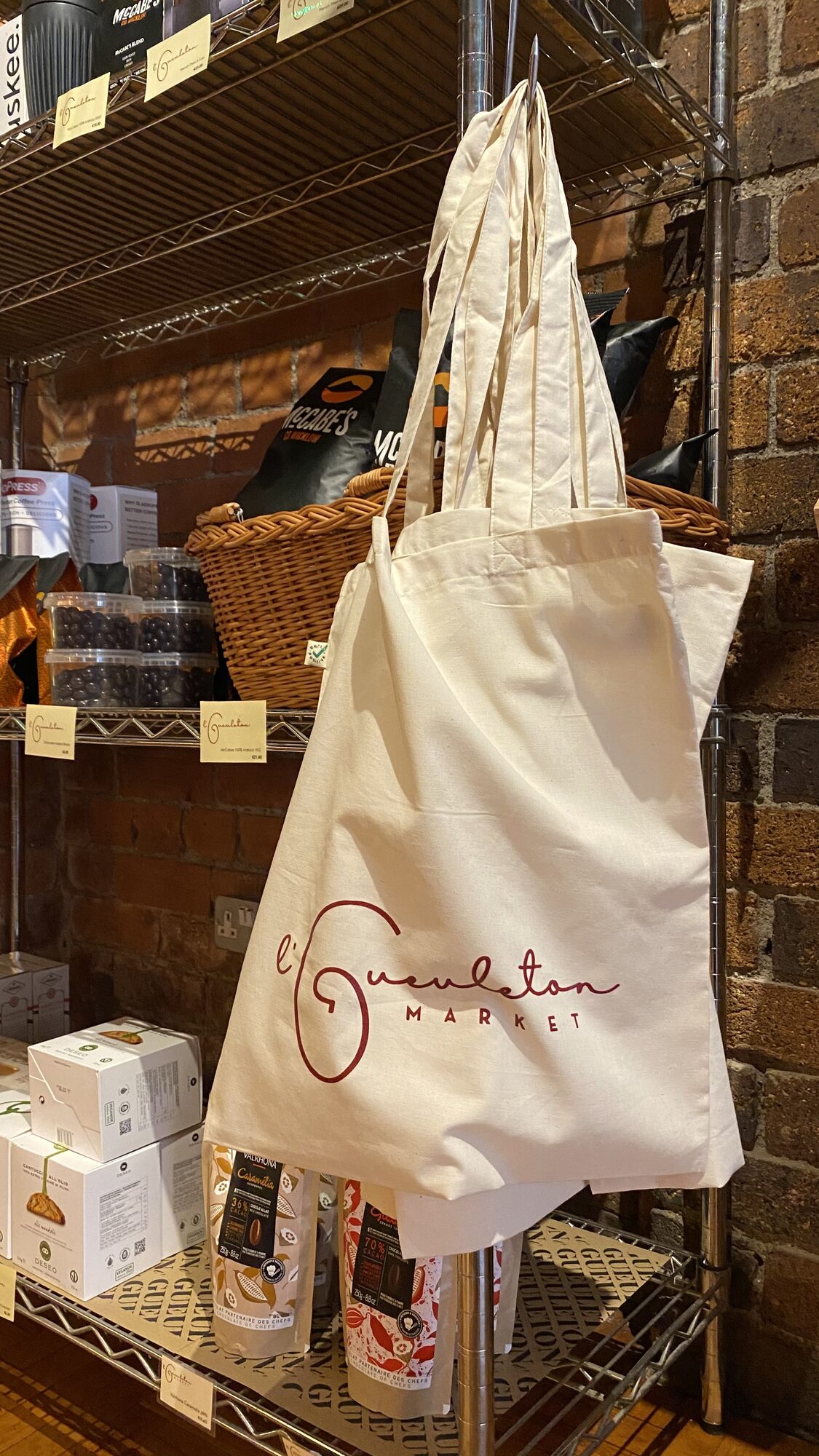
The next phase introduced a broader rebrand, coinciding with the launch of l’Gueuleton Market.
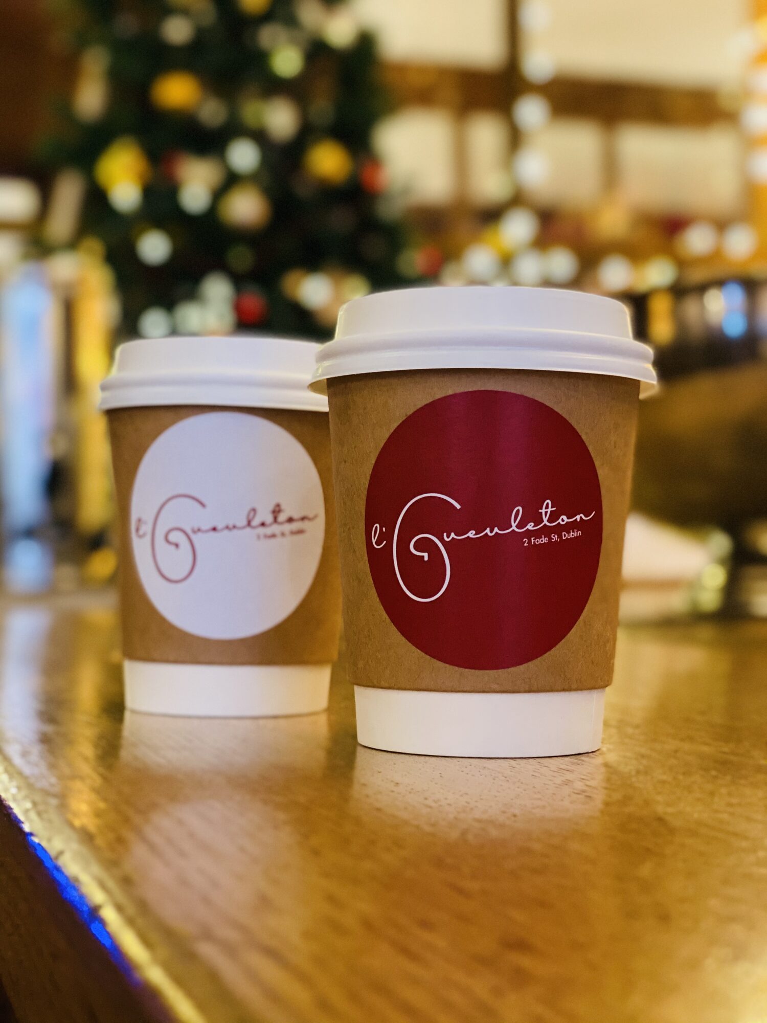
The new identity needed to work across the shopfront, takeaway counter, coffee cups, window decals, signage, packaging and drinks offer — while still feeling connected to the original bistro.
This phase moved the identity from temporary COVID-era adaptation into a more permanent, physical brand system.
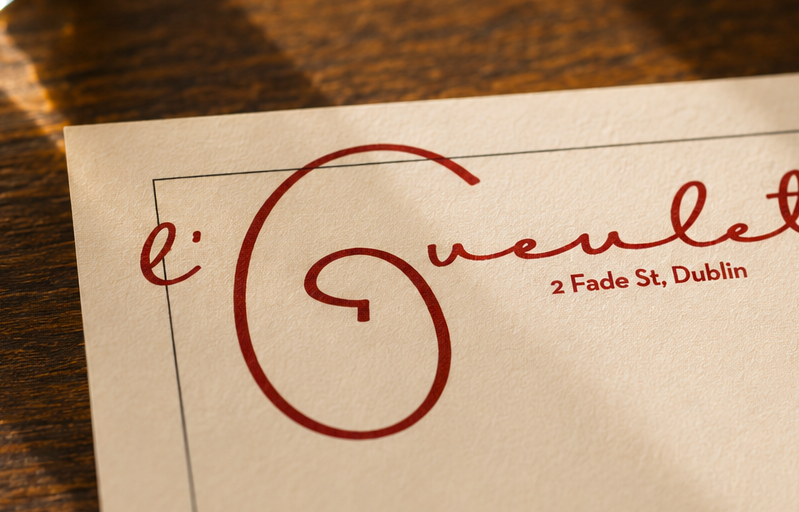
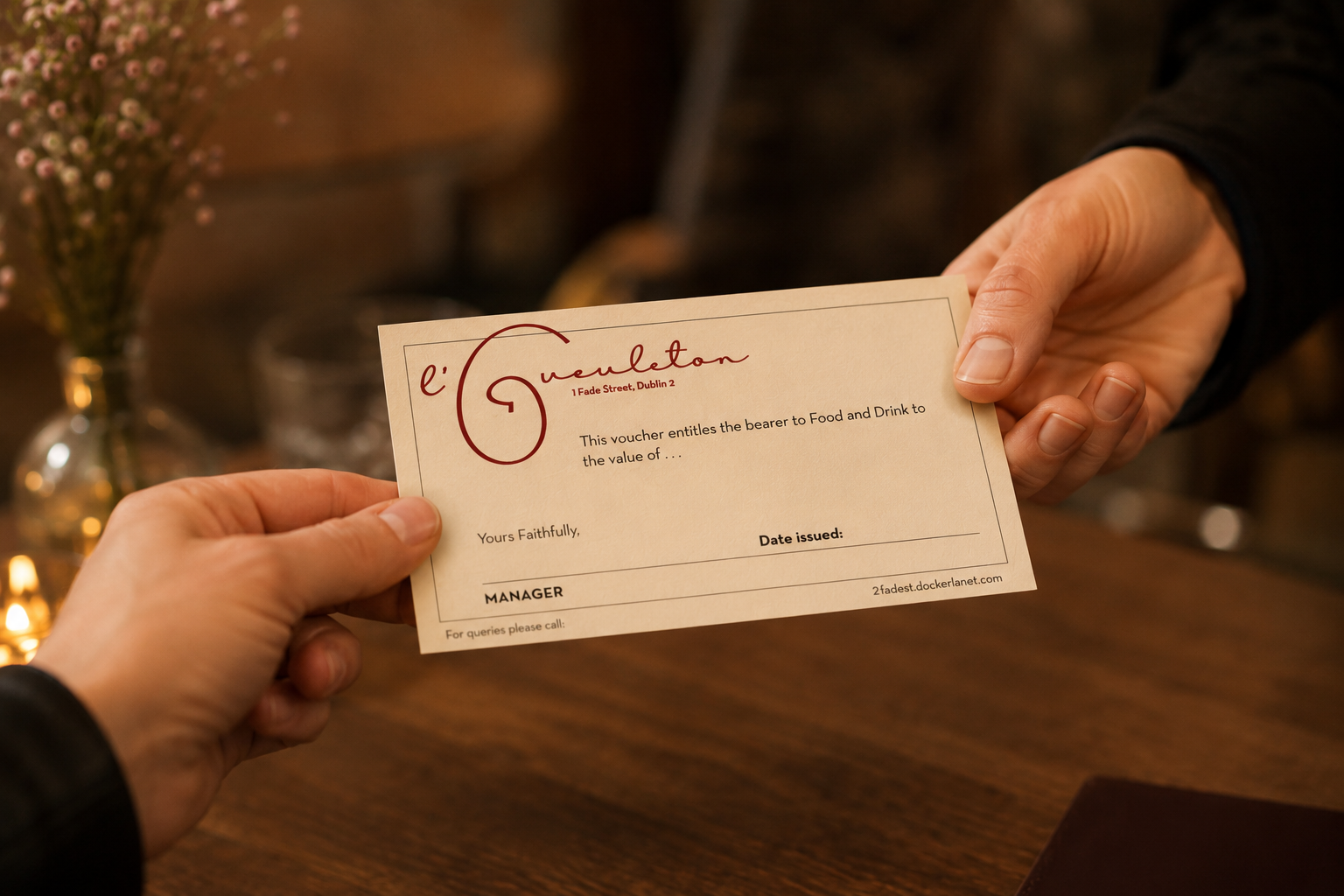
As the restaurant reopened, the identity was carried back into the dining room through refreshed menus, drinks lists, gift vouchers and printed details.
The system kept the warmth and familiarity of the bistro while giving the materials a clearer, more consistent visual language. The objects guests pick up — the menu, the wine list, the voucher — were re-imagined as a unified set.
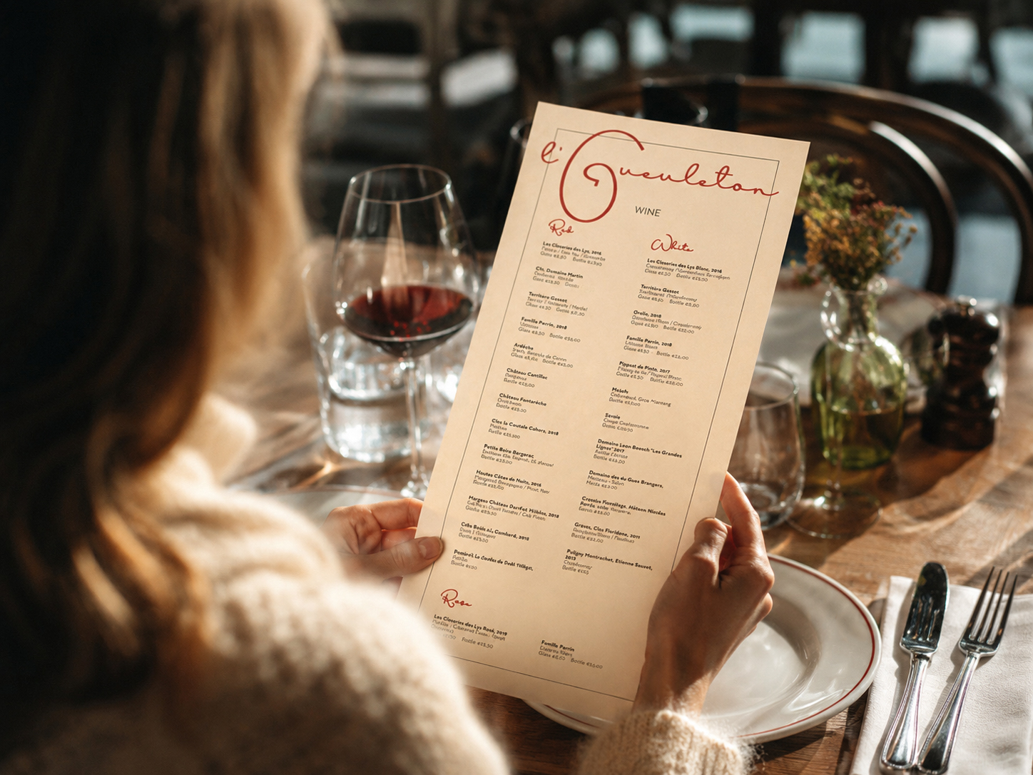
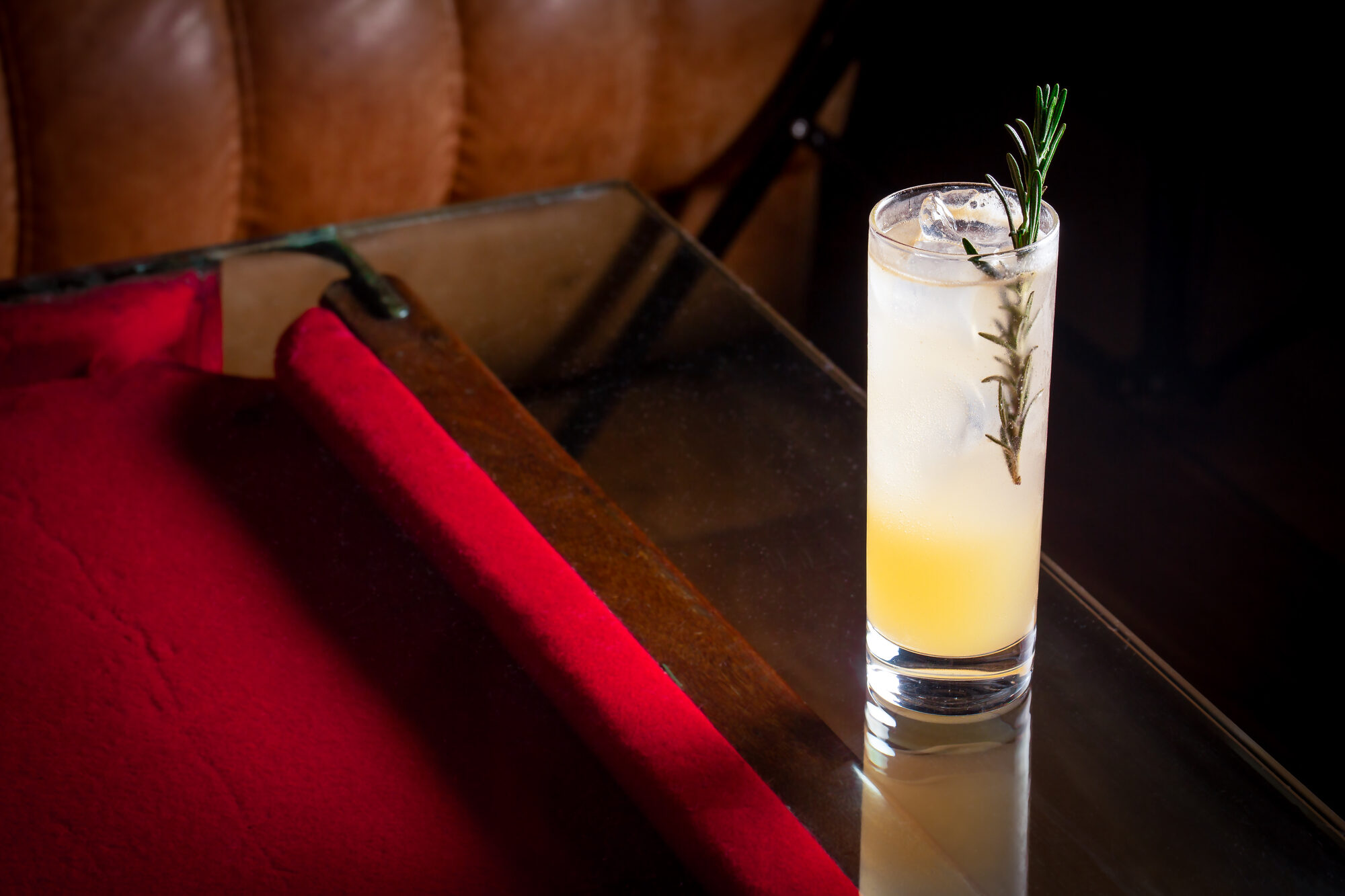
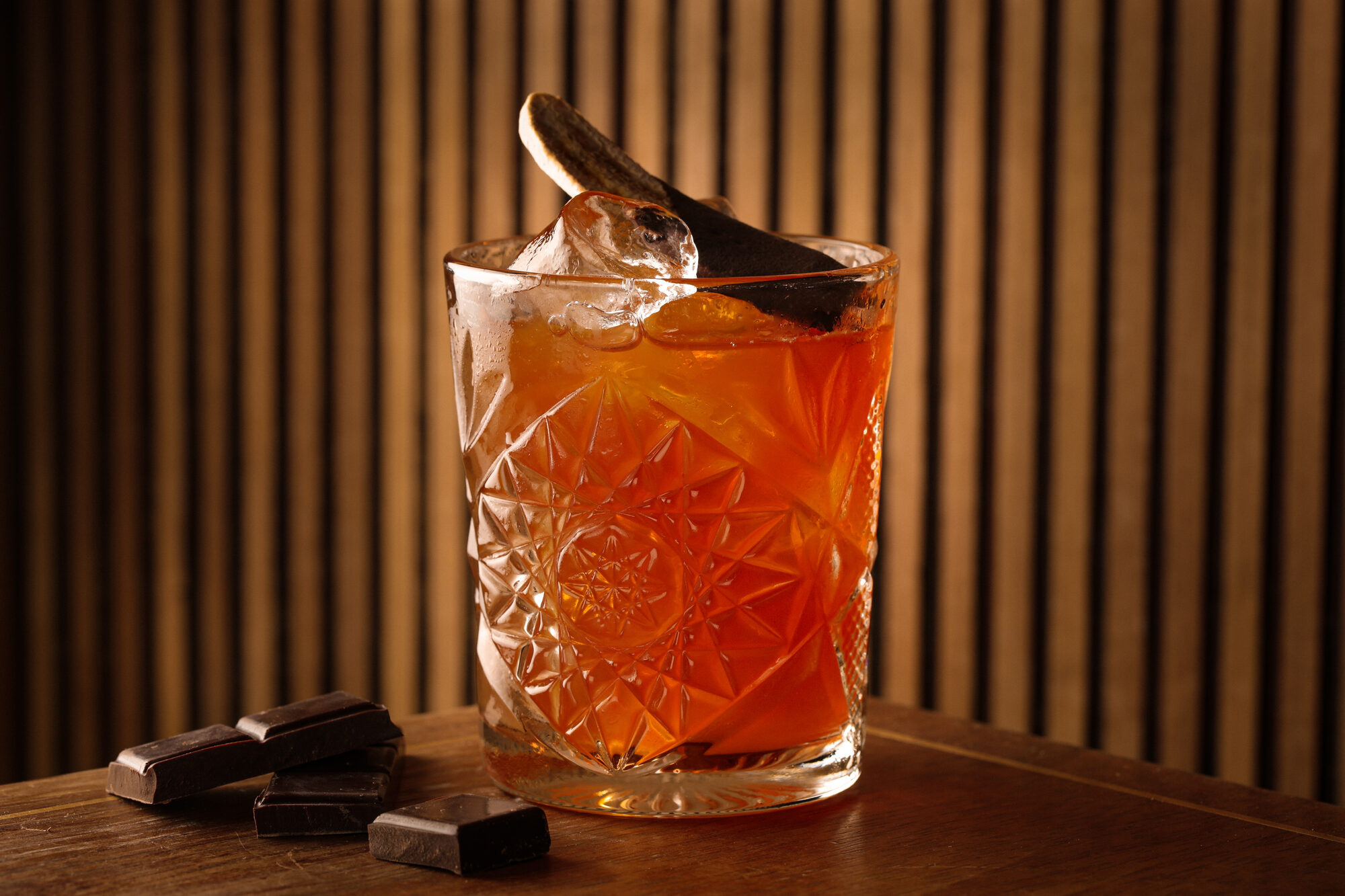
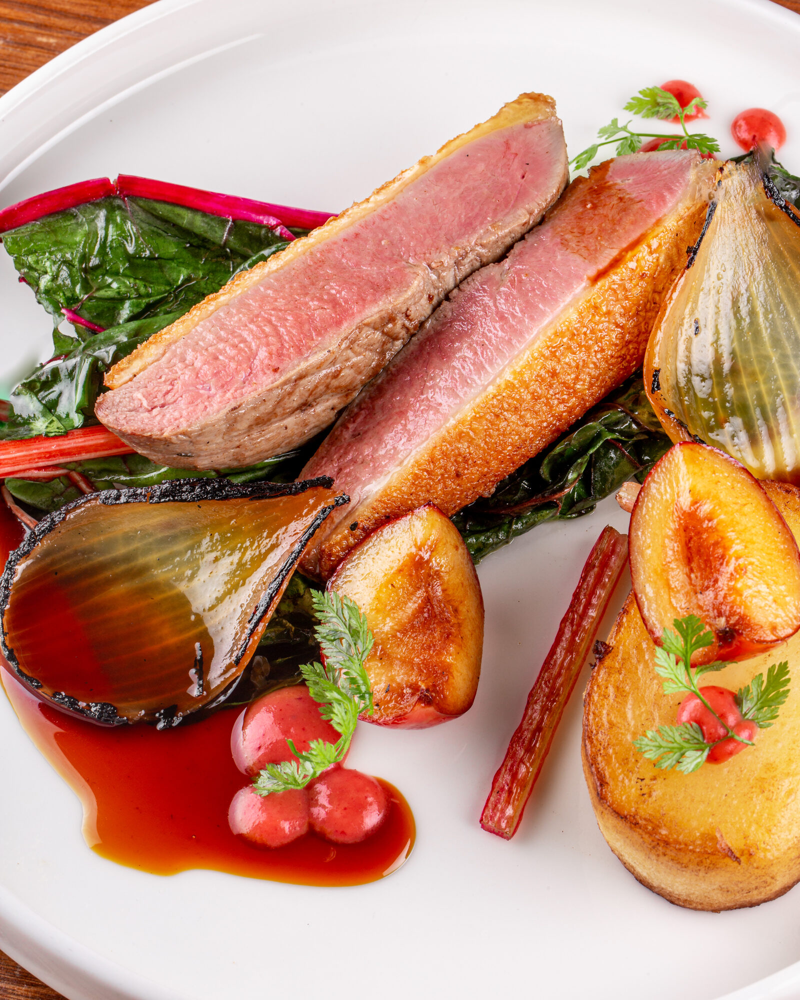
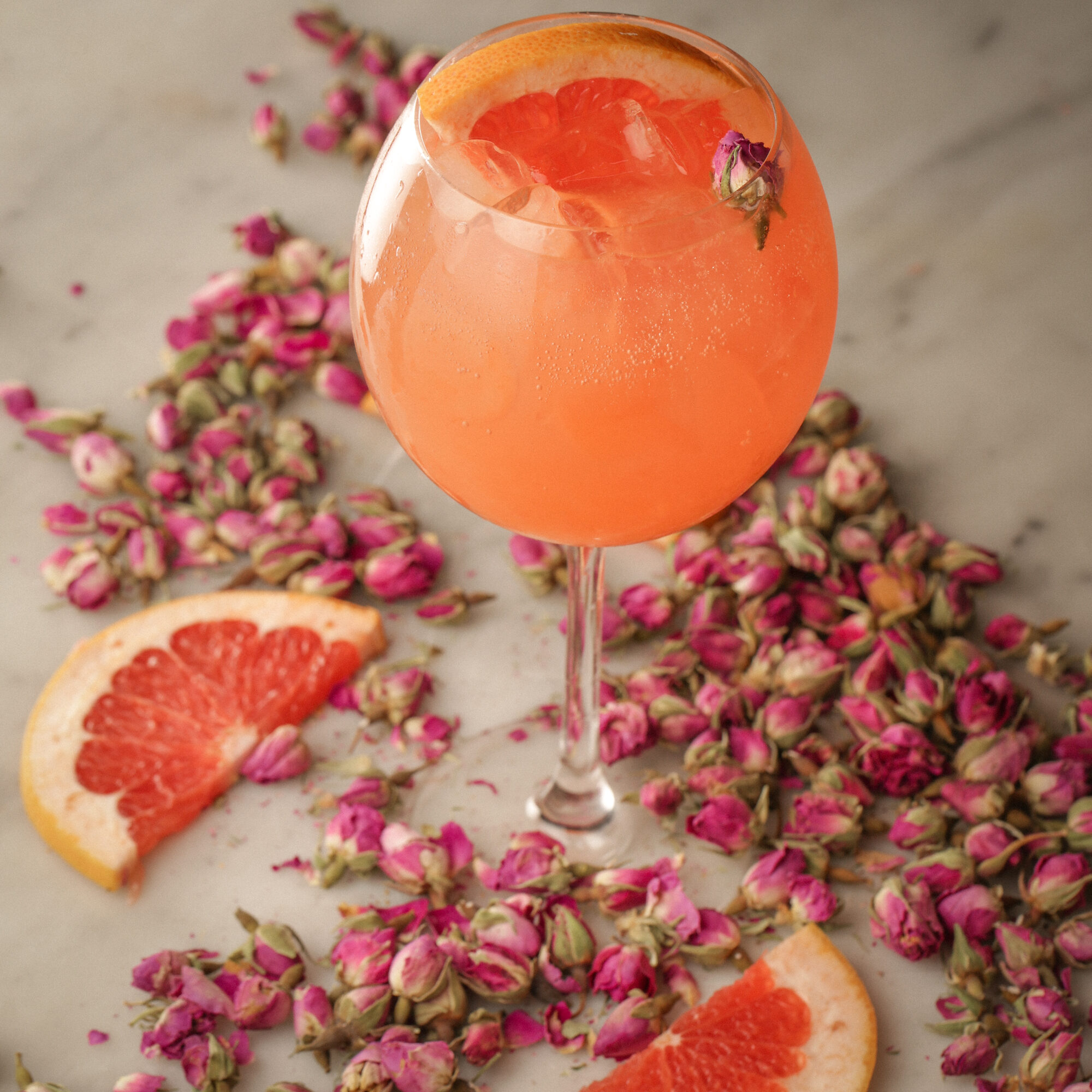
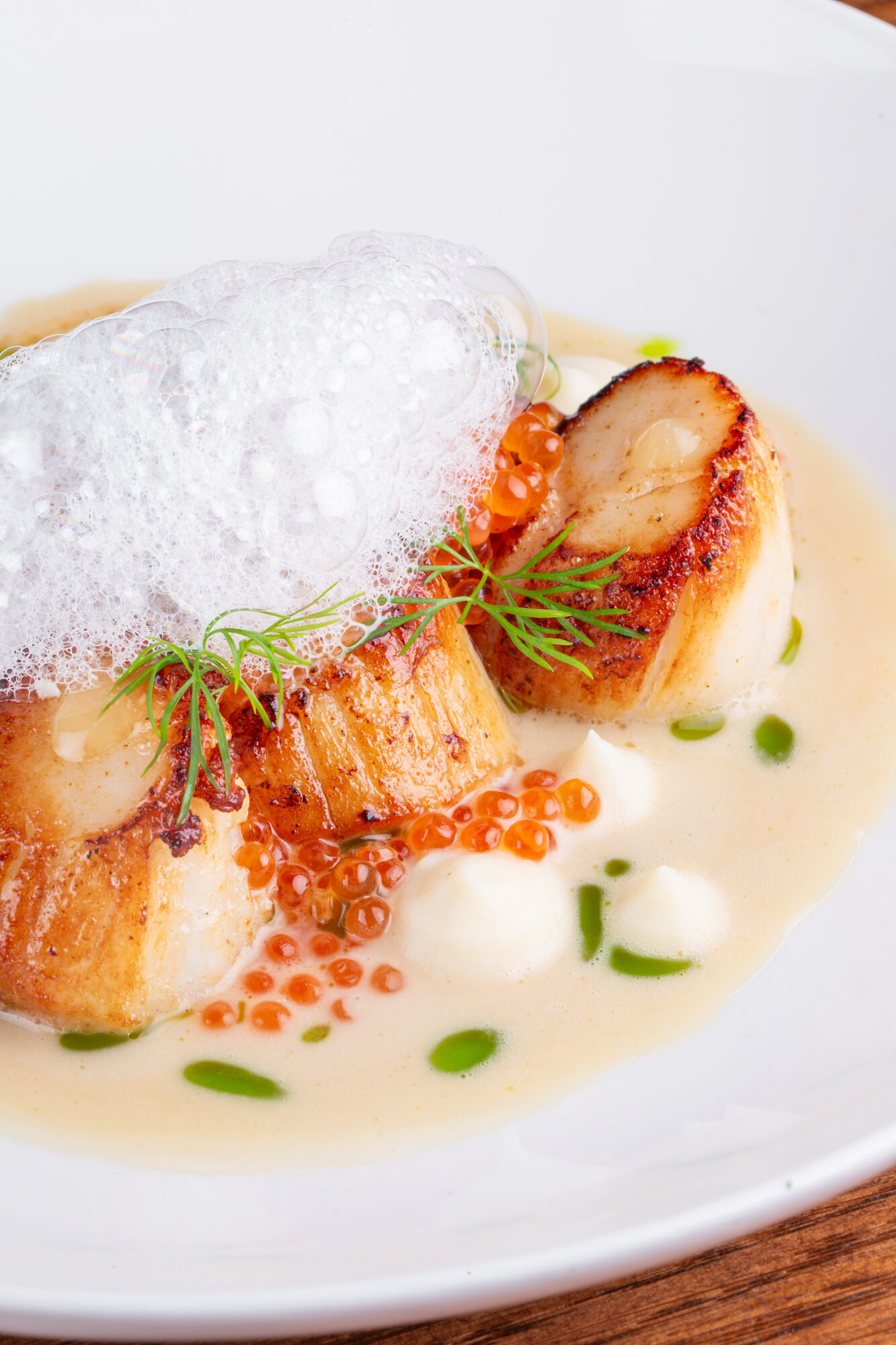
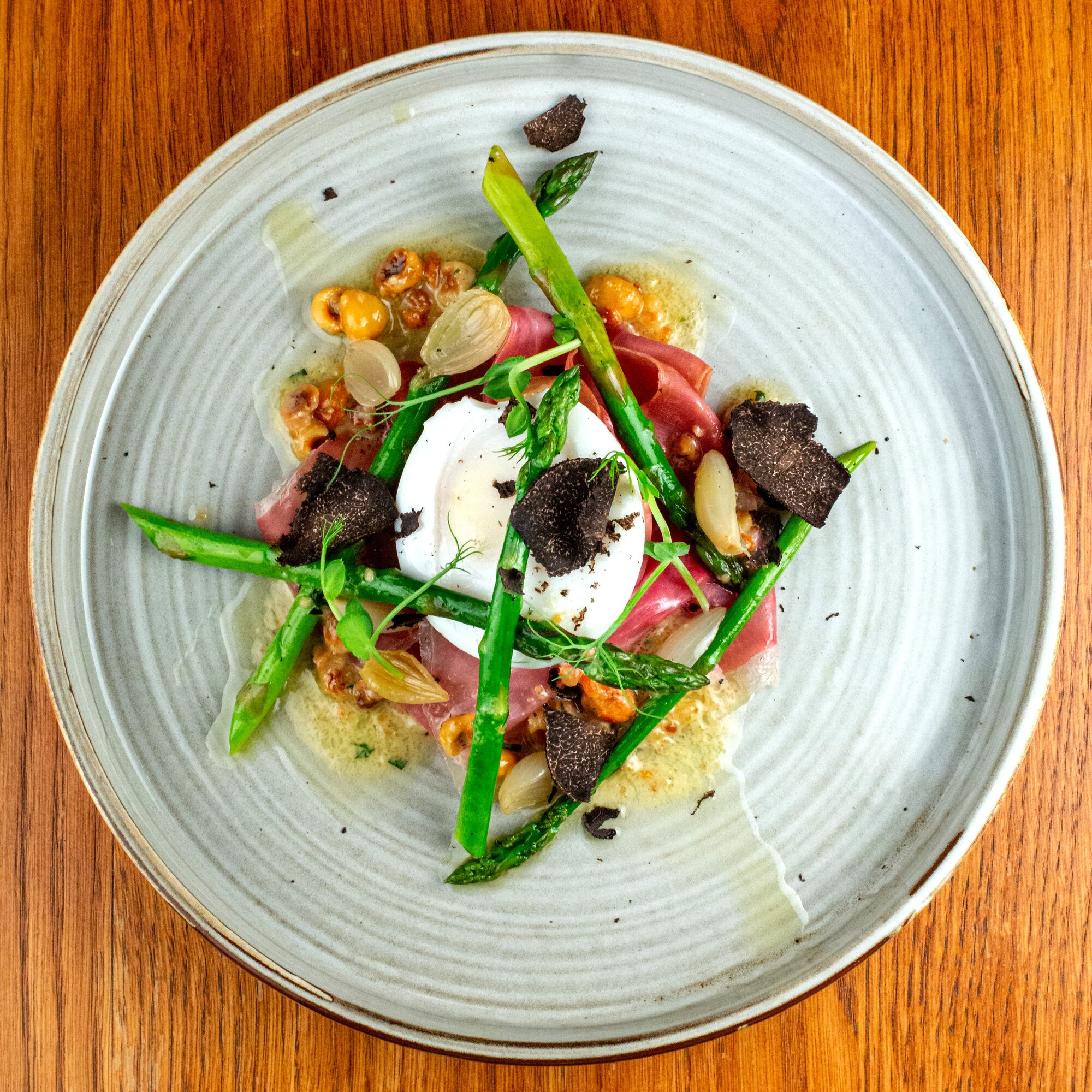
The photography shifted with each phase — practical product imagery for takeaway and delivery, warm market images for the new shopfront, and richer food and cocktail photography for the reopened restaurant and bar.
Built as a flexible image library usable across menus, web, social and booking platforms.
The finished system allowed l’Gueuleton to appear in several forms — bistro, market, takeaway, home-dining box, coffee counter, printed menu and social feed.
Each had its own tone and purpose, but they all belonged to the same visual world. The work proved a hospitality brand isn’t one logo — it’s a set of small moments designed to add up to one feeling.
Tell us what you’re opening, changing or trying to improve. Every enquiry is read by a person and replied to, usually within a working day.