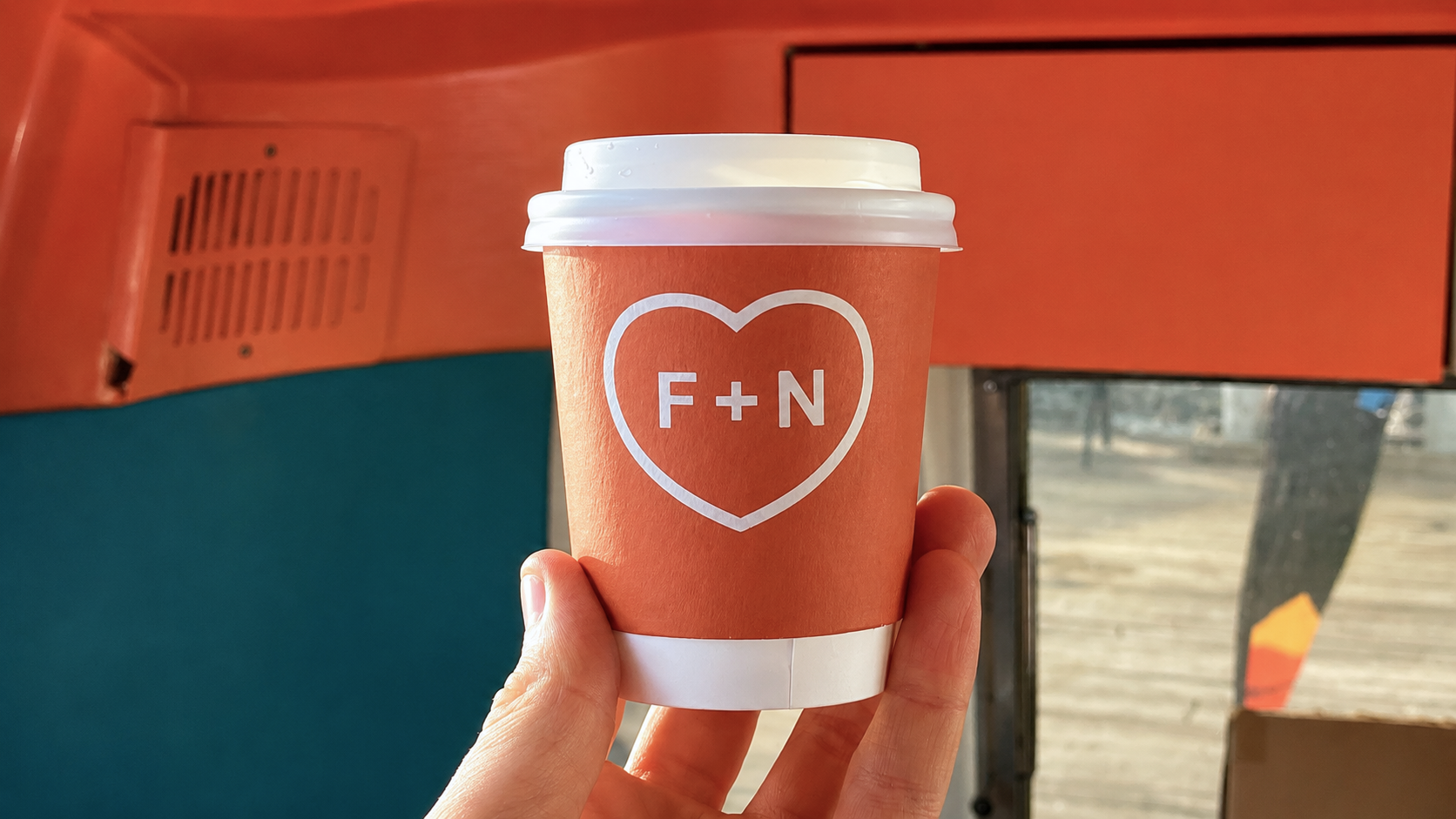
A seaside coffee identity for a mobile café on Killiney Beach. Built around a simple F + N heart mark, designed to live easily on cups, windows, vehicles and postcards.
Fred + Nancy’s is named after Fred and Nancy Homan, who lived at the site for many years and ran dances there until the early 1960s.
Killiney Beach has its own long history of swimming, holiday chalets, tea rooms, boats and weekend rituals by the sea. The brand had to carry some of that history — without feeling old-fashioned — and stay simple enough to work on a coffee cup, an Airstream window, a Land Rover decal and a postcard.


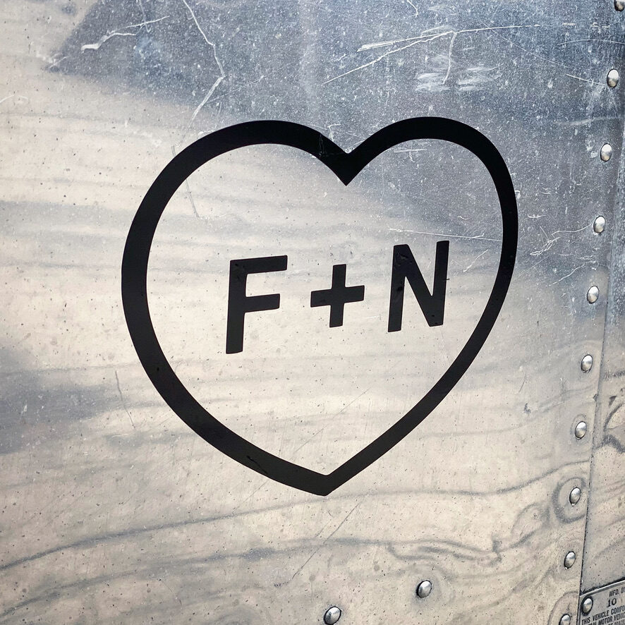
A symbol that could live on glass, metal, paper and cups — and feel like part of the place.
The logo uses the initials F + N inside a simple heart, referencing the romantic tradition of lovers carving their initials into a tree.
The aim was to create something instantly recognisable, easy to draw and easy to remember — a symbol that could live naturally on glass, metal, paper and cups. The mark is the centre of the identity; the design gives it space and lets repetition across objects tell the story.
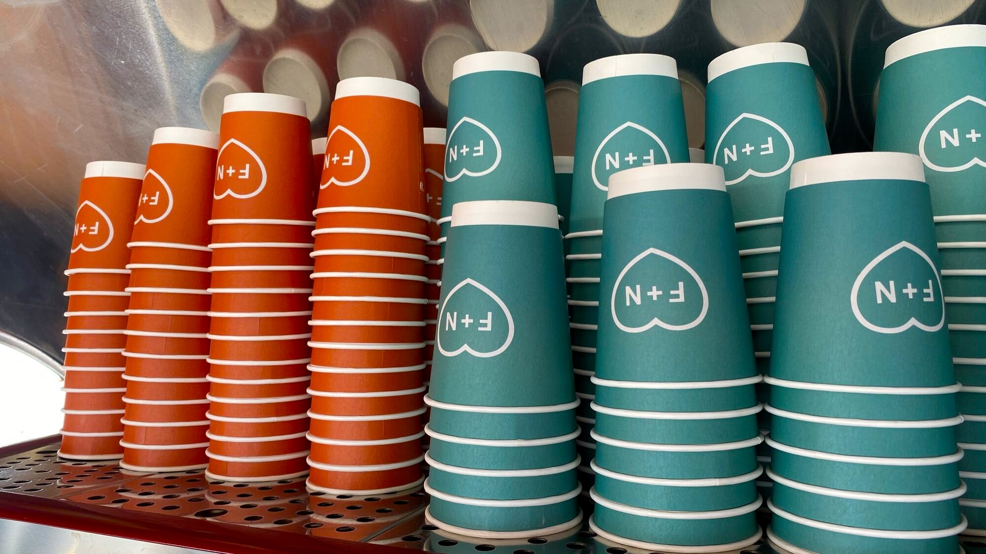

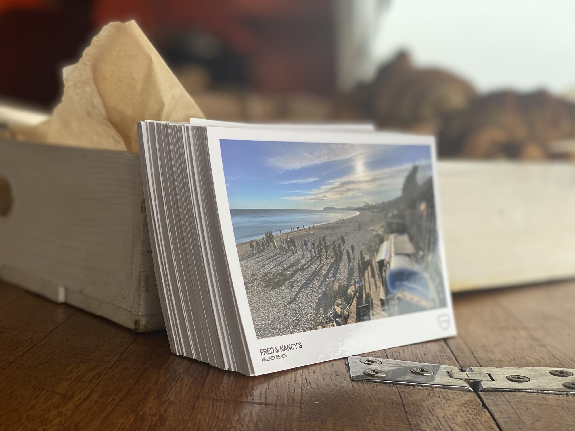
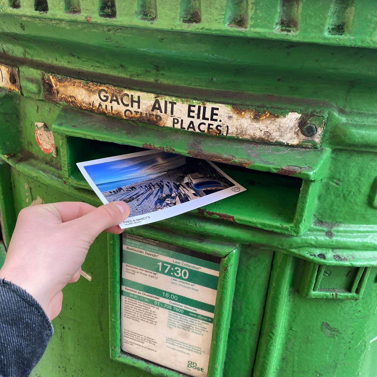
The system was applied across takeaway cups, Airstream window decals, a yellow Land Rover, black decals on metal and a set of postcard-style keepsakes featuring the beach.
The postcards extended the brand beyond the coffee itself — something tactile, local and memorable to take away or send. Each surface carried the mark forward to the next one.

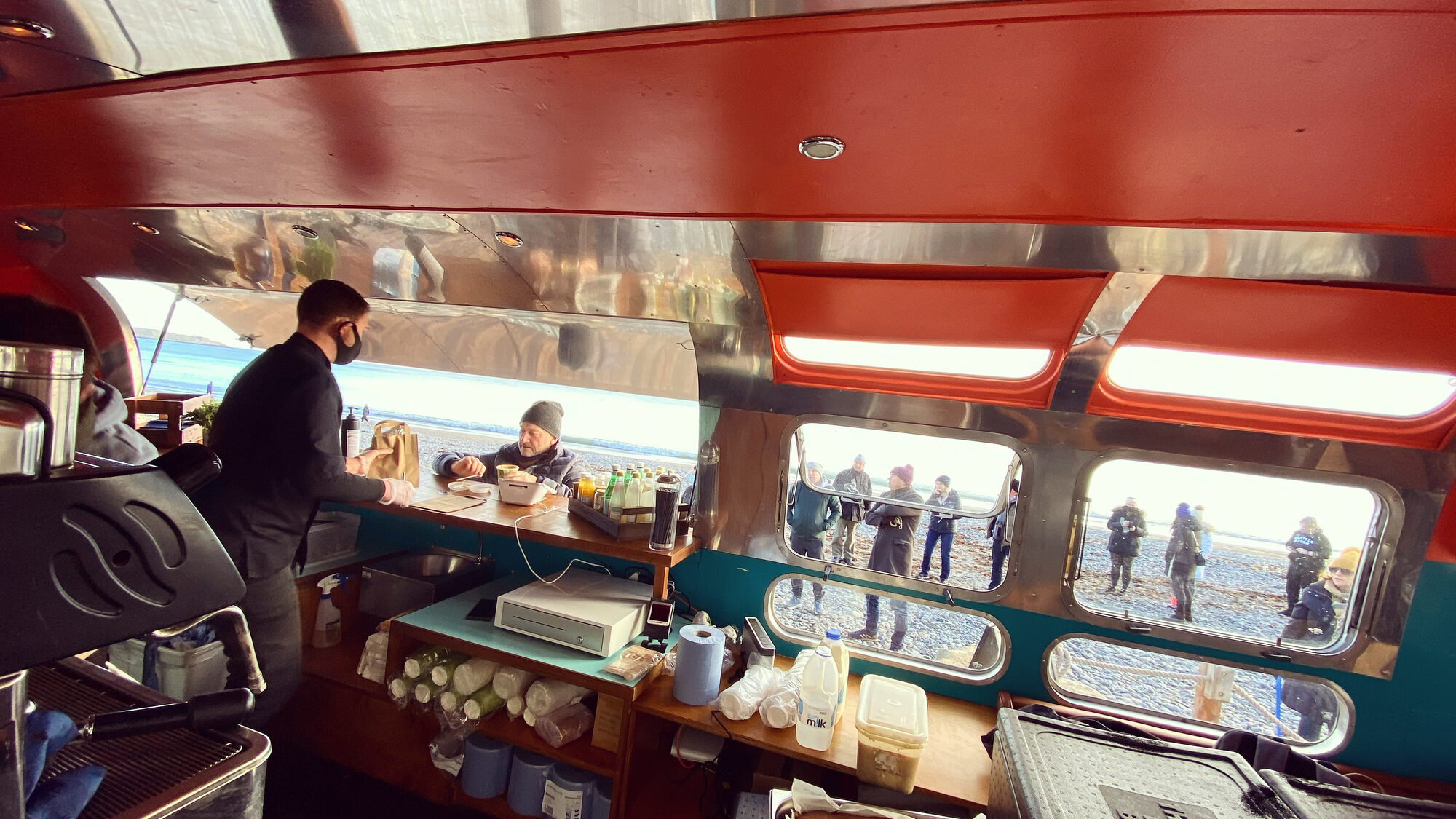
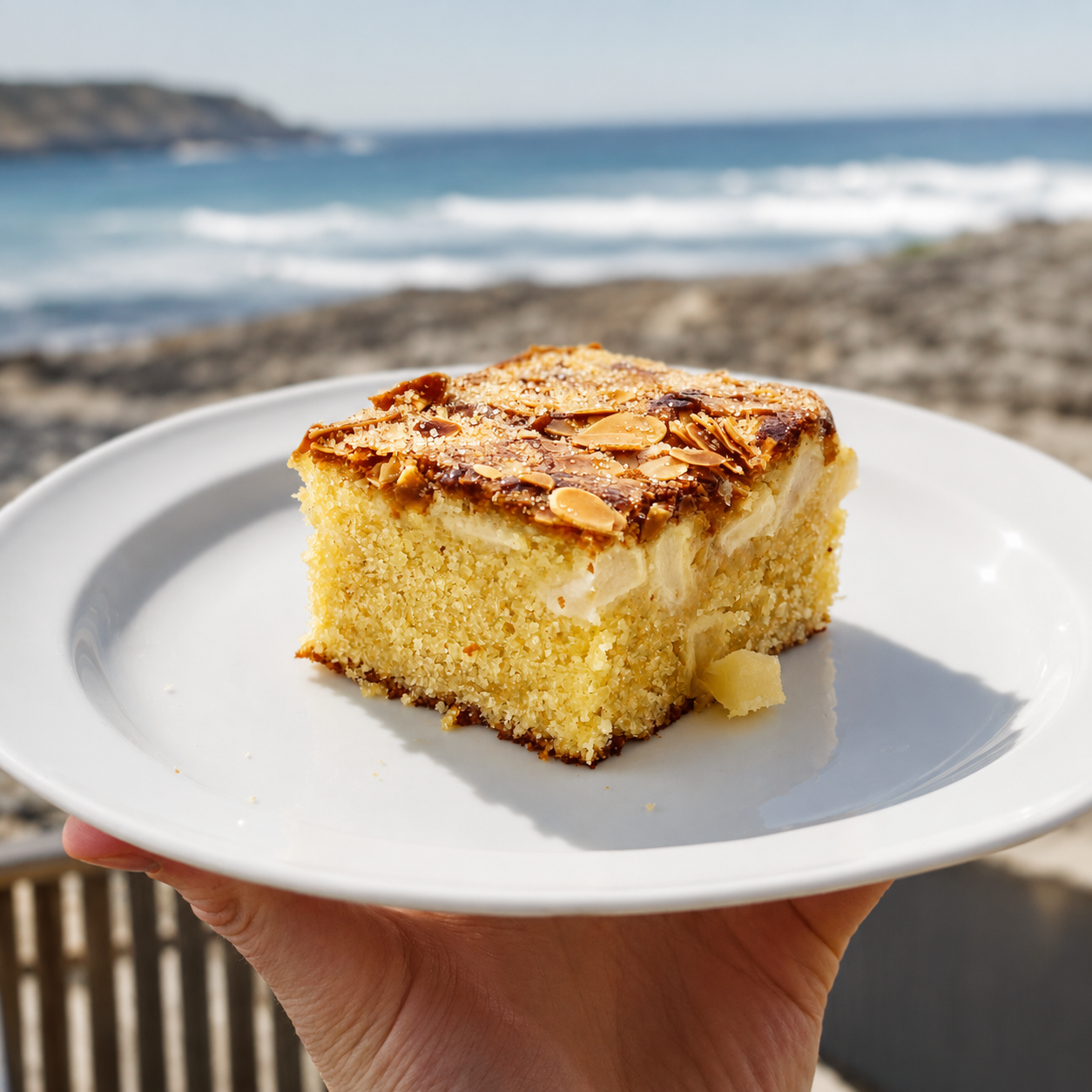
Brand photography captured the small things customers actually meet — the cup, the cake on the plate, the morning queue, the food coming through the hatch.
Built as a flexible image library for menus, social and signage. A weekend by the sea, rendered as a set of small objects.


Fred + Nancy’s works because the identity is simple enough to repeat and flexible enough to hold feeling.
It turns a coffee cup, a window, a van and a postcard into parts of the same story: a small seaside ritual named after two people who helped shape the life of the place.
Tell us what you’re opening, changing or trying to improve. Every enquiry is read by a person and replied to, usually within a working day.